How do I draw sketchnotes and doodles?
Lately I’ve been churning out a lot of sketchnotes:
I had to learn what @IstioMesh was in order to create this #sketchnote and it was incredibly easy to get started. Props to the #Istio team for clear documentation and resources that explain why service meshes are helpful! pic.twitter.com/VqS1E5E3Fg
— Denise Yu (@deniseyu21) August 22, 2018
I know that most people would *probably* not refactor from kubectl to Helm like in this toy example (check out the docs!) 🙃 here's a visual explanation of how @HelmPack and charts work, with cats and @Drake pic.twitter.com/L8AfRHEgDH
— Denise Yu (@deniseyu21) August 23, 2018
What is @pivotal Operations Manager, aka #OpsManager? in collaboration with @ssadvani pic.twitter.com/DrprdW85Re
— Denise Yu (@deniseyu21) August 20, 2018
The Istio one in particular got a big of traction on Twitter. So much so that I got invited to talk about about Istio at a Meetup, where I was almost certainly the least experienced person in the room in terms of actually using Istio:
On stage now it’s the #sketchnote boss @deniseyu21 teaching us about @IstioMesh pic.twitter.com/OpdcNPxu1Y
— Container Camp (@containercamp) August 28, 2018
This has led to quite a few people asking me lately, “How do you create these drawings?”, and, “Can you draw something for me?”
To the second question: Probably not, at least not right now. I just have too many projects and conference speaking commitments in flight until the end of October. Also, I’m moving across an ocean to Toronto! Come say hi if you’re there.
To the first question, I’m more than happy to share my process. Here we go:
Step One: Research
I mostly draw about Open Source projects. I like to try my luck on YouTube first, and search for something along the lines of “Intro to Istio”, in hopes that someone has already organised all the information in a linear fashion in a conference talk. I’ll watch a few videos, and start thinking about the structure of my sketchnote while I’m listening.
If I can’t find a decent, 101-level explainer video, I’ll do some digging for tutorials and consult the official documentation.
If I’m lucky enough to have access to a Subject Matter Expert within Pivotal, I’ll ask them for 20 minutes of time over a video call, to talk me through their domain. I’ll usually ask the following questions:
- What customer problem is this project solving?
- What are the most interesting features that prospective users should know?
- Tell me about the architecture, in very high level terms
- Tell me about the key use cases
- What’s on the roadmap for the next 3 months or so?
That usually generates a story, or at least a set of bulletpoints like a BuzzFeed listicle, that I can convert into a drawing.
Step Two: Rough draft
I use regular printer paper (because I’m precious about my expensive cartridge paper) and fine liner to doodle out a first attempt at representing all the information. I don’t have fully fleshed-out characters or scenes yet – at this point it’s just playing around with what can fit where, and how the ideas can feed into one another. Here’s the rough copy of the CredHub sketch:
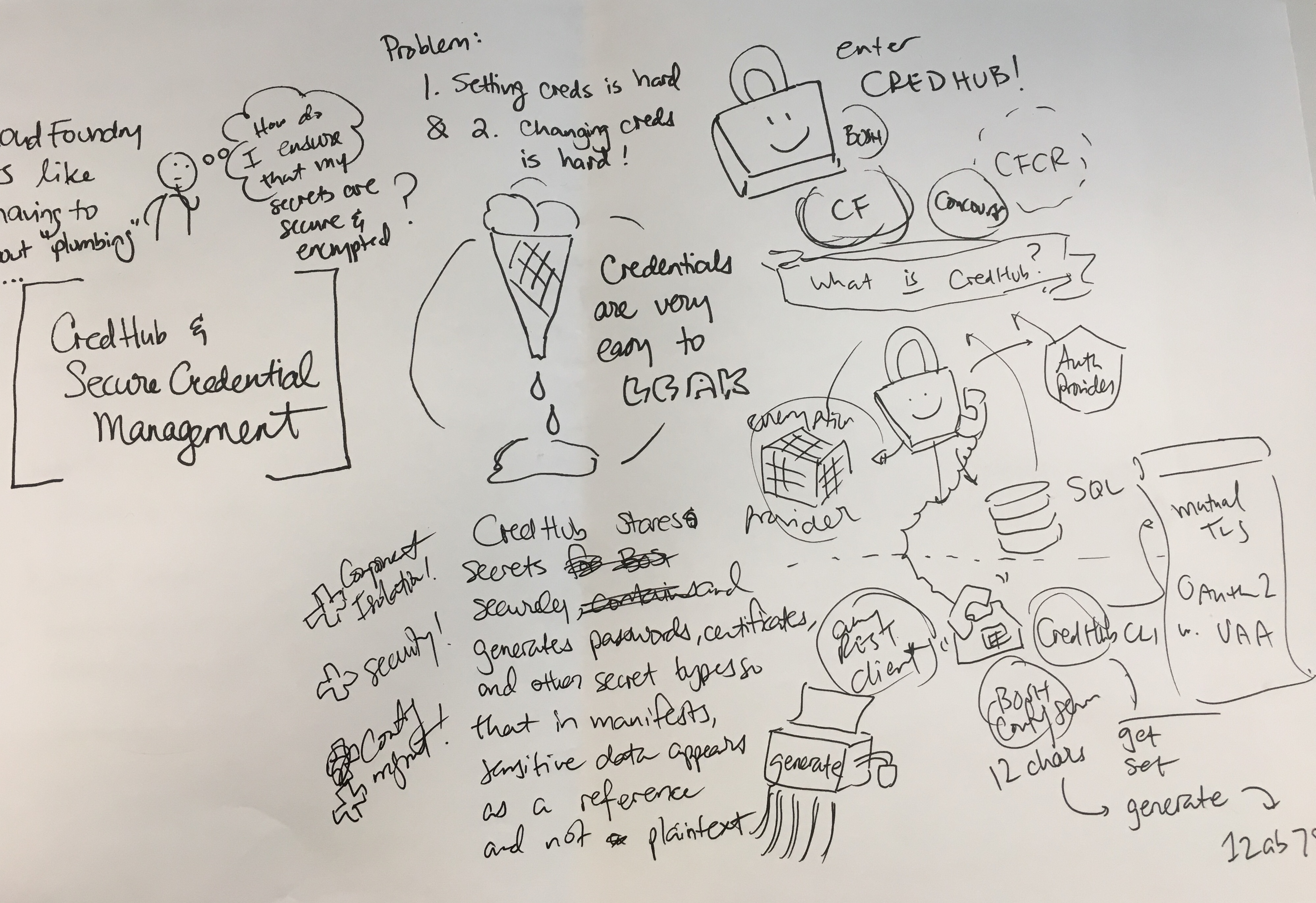
I snap a photo with my iPhone, and Slack/email it to someone who knows more about the domain, for a quick round of feedback. I’ll hop on a call and explain it to them if it’s a really messy rough draft :-)
Step Three: Line art
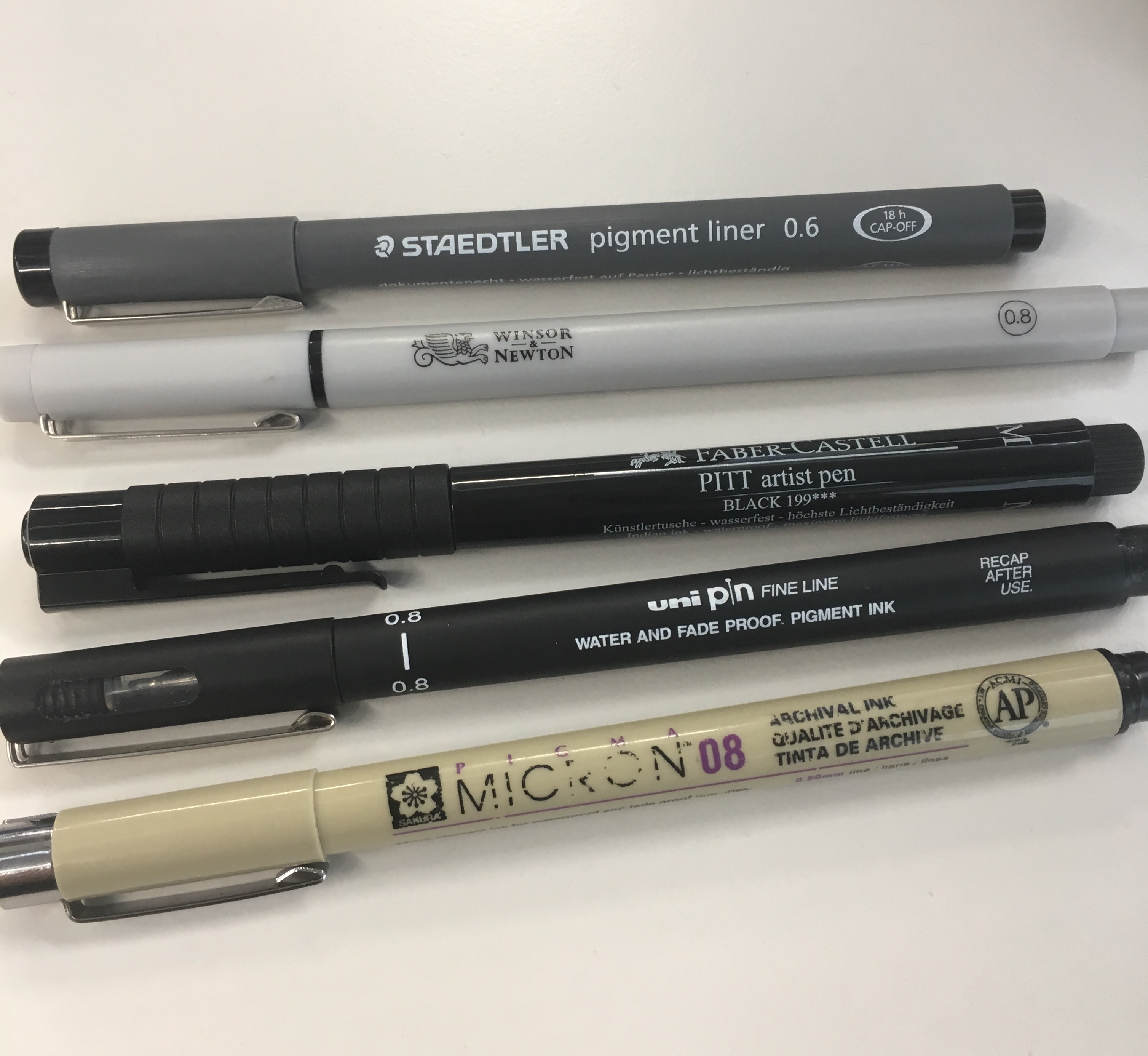
Incorporating any feedback from the rough draft stage, I’ll start to create the line art, on cartridge paper with fine liner. Cartridge paper helps to prevent the lines from smudging. I have fat, clumsy hands, and I have a habit of resting my hand on the paper as I’m drawing, so I need something that pretty much dries instantly. I use at least 0.5mm pens, but lately I’ve been preferring 0.8mm. Thicker lines in the initial line art are good because:
- They will look cleaner in the final copy
- They will discourage you from trying to pack in too much detail/text
Step Four: Digitise
I experimented with using the scanners in the office for a while, but even at 600dpi (the highest resolution) some of the smoothness of my lines was still getting lost. I have an iPhone 6S, which takes ridiculously high-resolution photos, so I just try to find a sunny patch of table in the office, put the drawing on it, and try not to cast a shadow while I take a picture from directly above.
I send the photo to myself on Airdrop or Slack, then open it in Gimp – not necessarily because it’s the best tool for this job, but simply because I used Gimp a lot when I was a teenager and am already familiar with a lot of the controls. Adobe Photoshop or Illustrator is almost certainly better, but I don’t have a license and am too lazy to learn a new toolset again.
In Gimp, I rotate and crop the photo, then I just dial the contrast setting up to around 100. I just want to get the picture to the point where all the background is pure white, and all the lines are pure black. If, after the contrast-blast, the lines are looking a little too jagged, then I’ll apply a median blur filter of 1px or 2px radius to soften things out a little bit.
I’ll also rearrange stuff and fix stray lines a bit, but I try not to over-fix – my personal style involves a certain degree of imperfection, so I try to keep that feel.
Once I’m happy with the line art I export it as a low-compression PNG file.
Step Five: Coloring
I used to color stuff in Gimp, but there’s a software bug that made this reallllly annoying, so I switched to using another free tool, Krita. I originally downloaded this because I bought myself a Wacom Intuos tablet, and this was the first free tool I found that supported pressure sensitivity.
For most of what I color, I do these things:
- Create a transparent layer above the base image for all color work
- Set that layer mode to ‘Multiply’
- In the base layer, use the magic select tool to grab a contiguous area (Krita can detect across layers too), then in the Colors layer, ‘Grow’ the selection by 1-3px (depending on thickness of the line), and use bucket fill.
- If the line art is broken or incomplete, I use the polygon select to approximate the area I want to color in, then use bucket fill again, and use the paintbrush in ‘Basic-1’ mode to fill in the edges.
I sometimes use my tablet, but right now I’m doing all my work on a Macbook Air which doesn’t have enough muscle to keep up with the tablet in realtime, so it’s more annoying than helpful. I’ll only break out the tablet now if I need to do tapering lines or add handwriting. I mostly just use the mouse for coloring.
I’m not great at shading but I try to give all the animals some depth by at least giving them a shadow, and some shading bits on their bodies and surrounding objects. I set up a new transparent Multiply layer for shadows, and will first try to use the same color, but sometimes it doesn’t work because I tend to use a lot of pastels and light colors multiplying doesn’t look that obvious. So I’ll shade yellows with light orange, pink with light red, etc.
Step Six: Publishing
I save the final product as a PNG file again, and I’ll upload both the PNG files and the Gimp and Krita files to Google Drive. This is really important, because if you lose the layered versions, then it becomes really painful to make clean modifications later.
I publish a subset of my work on Tumblr and Twitter, and some of it on my work Slack.
All of my work is pending Creative Commons licensing, so you may retweet and share with your colleagues/friends. Sharing with attribution is totally fine!
Hope this helps!